Tutorial 1
Contents
![]()
Tutorial 1#
Machine Learning III, Clustering & Classification
[insert your name]
Important reminders: Before starting, click “File -> Save a copy in Drive”. Produce a pdf for submission by “File -> Print” and then choose “Save to PDF”.
To complete this tutorial, you should have watched Video 11.1, 11.2, and 11.3
Imports
# @markdown Imports

# Imports
import numpy as np
import matplotlib.pyplot as plt
import ipywidgets as widgets  # interactive display
import math
from sklearn.cluster import KMeans
---------------------------------------------------------------------------
ModuleNotFoundError                       Traceback (most recent call last)
Cell In[1], line 8
      6 import ipywidgets as widgets  # interactive display
      7 import math
----> 8 from sklearn.cluster import KMeans

ModuleNotFoundError: No module named 'sklearn'
Plotting functions
# @markdown Plotting functions
import numpy
from numpy.linalg import inv, eig
from math import ceil
from matplotlib import pyplot, ticker, get_backend, rc
from mpl_toolkits.mplot3d import Axes3D
from itertools import cycle


%config InlineBackend.figure_format = 'retina'
plt.style.use("https://raw.githubusercontent.com/NeuromatchAcademy/course-content/master/nma.mplstyle")

def plot_fitted_polynomials(x, y, theta_hat):
  """ Plot polynomials of different orders

  Args:
    x (ndarray): input vector of shape (n_samples)
    y (ndarray): vector of measurements of shape (n_samples)
    theta_hat (dict): polynomial regression weights for different orders
  """

  x_grid = np.linspace(x.min() - .5, x.max() + .5)

  plt.figure()

  for order in range(0, max_order + 1):
    X_design = make_design_matrix(x_grid, order)
    plt.plot(x_grid, X_design @ theta_hat[order]);

  plt.ylabel('y')
  plt.xlabel('x')
  plt.plot(x, y, 'C0.');
  plt.legend([f'order {o}' for o in range(max_order + 1)], loc=1)
  plt.title('polynomial fits')
  plt.show()
Helper functions
# @markdown Helper functions

def ordinary_least_squares(X, y):
  """Ordinary least squares estimator for linear regression.

  Args:
    x (ndarray): design matrix of shape (n_samples, n_regressors)
    y (ndarray): vector of measurements of shape (n_samples)

  Returns:
    ndarray: estimated parameter values of shape (n_regressors)
  """

  # Compute theta_hat using OLS
  theta_hat = np.linalg.inv(X.T @ X) @ X.T @ y

  return theta_hat


def evaluate_poly_reg(x, y, theta_hat, order):
    """ Evaluates MSE of polynomial regression models on data

    Args:
      x (ndarray): input vector of shape (n_samples)
      y (ndarray): vector of measurements of shape (n_samples)
      theta_hats (dict):  fitted weights for each polynomial model (dict key is order)
      max_order (scalar): max order of polynomial fit

    Returns
      (ndarray): mean squared error for each order, shape (max_order)
    """

    X_design = make_design_matrix(x, order)

    y_hat = np.dot(X_design, theta_hats[order])

    residuals = y - y_hat

    mse = np.mean(residuals ** 2)

    return mse
Exercise 1: Exploring details of K-Means#
A) Wrong clustering#
Below I have generated some data and clustered with K-Means. The resulting cluster labels are shown by color.
Execute to visualize
# @markdown Execute to visualize
# Create data
np.random.seed(0)

data1 = np.random.multivariate_normal((60, 1), [[50, 0], [0, .1]], size=(100,))
data2 = np.random.multivariate_normal((50, 5), [[50, 0], [0, .1]], size=(150,))

data = np.concatenate((data1, data2), axis=0)

clustering = KMeans(n_clusters = 2)
clustering.fit(data)
labels = clustering.labels_

fig, ax = plt.subplots()
for k in range(2):
    ax.plot(data[labels==k, 0], data[labels==k, 1], 'o', label='Cluster '+str(k))
    ax.set(aspect='auto')
ax.legend();
---------------------------------------------------------------------------
NameError                                 Traceback (most recent call last)
Cell In[4], line 10
      6 data2 = np.random.multivariate_normal((50, 5), [[50, 0], [0, .1]], size=(150,))
      8 data = np.concatenate((data1, data2), axis=0)
---> 10 clustering = KMeans(n_clusters = 2)
     11 clustering.fit(data)
     12 labels = clustering.labels_

NameError: name 'KMeans' is not defined
i) Why has the clustering not worked? Hints: the plot above should tell you everything you need to know, think about the cluster assignment step with this data
ii) What could we do to get the clustering to work properly?
Answer#
i)
ii)
B) Objective function of K-Means#
Is the graph below of the value of the objective function J over the iteration step of the K-Means clustering possible with a correctly implemented K-Means algorithm? Why or why not?
Execute to visualize
# @markdown Execute to visualize
x = np.arange(0, 50)
J = 50-x-2*np.sin(x)

fig, ax = plt.subplots()
ax.plot(x, J)
ax.set(xlabel='Iteration of K-means clustering', ylabel = 'J');
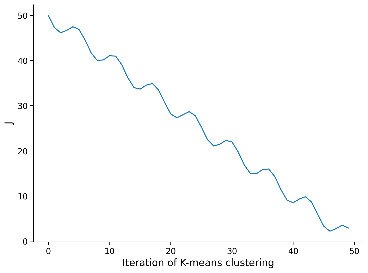
Answer#
Answer here
(Optional) Exercise: Implement K-Means yourself#
Later in this tutorial we will use sklearn to compute K Means. This isn’t too difficult an algorithm to code yourself though and doing so can solidify your understanding. Use the pseudocode in video 11.3 as a starting point.
# your code here
The Data#
We will be looking at real RNAseq data to cluster cells into different cell types. Specifically, we will be using a dataset of Peripheral Blood Mononuclear Cells (PBMC) available from 10X Genomics.
In RNA-seq, we are measuring the gene expression for each cell for a large number of cells. When genes are expressed, they’re transcribed into mRNA, which is then translated into proteins. In RNA-seq, we sequence how many mRNA molecules are present that correspond to each gene we’re interested in.
Execute the next cell to download the data.
Execute to get data
# @markdown Execute to get data
import requests
import urllib.request
import io
import tempfile
import tarfile
import os
import scipy.io

respurl = 'https://cf.10xgenomics.com/samples/cell/pbmc3k/pbmc3k_filtered_gene_bc_matrices.tar.gz'
with requests.get(respurl,stream = True) as File:
    # stream = true is required by the iter_content below
    with tempfile.NamedTemporaryFile(delete=False) as tmp_file:
        with open(tmp_file.name,'wb') as fd:
            for chunk in File.iter_content(chunk_size=128):
                fd.write(chunk)

with tarfile.open(tmp_file.name,"r:gz") as tf:
  for tarinfo_member in tf:

    if os.path.splitext(tarinfo_member.name)[1] == ".mtx":
        mtx_file = tf.extractfile(tarinfo_member)
        content = mtx_file.read()
        data = scipy.io.mmread(io.BytesIO(content))

data = np.array(data.todense()).T
What we have downloaded is a unique molecular identified (UMI) count matrix (stored as data).
The rows of this matrix are the cells (2700) and the columns are the different genes we are examining (32738).
Each value in this matrix represents the number of molecules for the corresponding gene that are detected in the corresponding cell. I.e. if the value in the 5th row and 10th column is 3, there were 3 molecules of gene 10 found in cell 5.
Step 1: Remove non-cells#
First, we remove any rows that seem to correspond to things that aren’t really cells. We may have low-quality cells, empty droplets or errors where more than one cell have been sequenced together (a row corresponds to 2 or more cells). Really you would use a variety of metrics to ascertain the quality of each cell but we can use a fairly simple one for now - the number of unique genes detected in each cell. Low-quality cells or droplets would have very small number of genes, while double or tripled cells would have a lot.
We can get the number of unique genes per cell by finding the number of non-zero values in the matrix in each row:
np.sum(data > 0, axis=1)
n_genes = np.sum(data > 0, axis=1)

fig, ax = plt.subplots()
ax.hist(n_genes, 100, color='k');
ax.set(xlabel = 'Number of unique genes', ylabel = 'Number of cells');
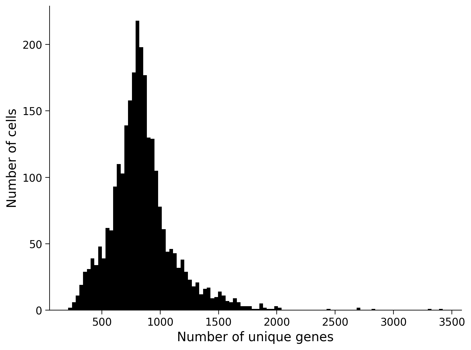
Let’s remove cells that are at the two extremes of this distribution (fewer or more unique genes than most of the cells). We will remove cells that not in the middle 5 - 95th percentile range. Note that this is similar to building a confidence interval from bootstrapping!
lower_threshold = np.percentile(n_genes, 5)
upper_threshold = np.percentile(n_genes, 95)

keep_cells = (n_genes > lower_threshold) & (n_genes < upper_threshold)

quality_cell_data = data[keep_cells]
Step 2: Remove uninformative genes#
In our data, some genes are not present in any cell. These genes are completely uninformative so we will remove them. Seurat, an R package for RNA-seq analysis, takes this further and only keeps the top 2000 most variable genes (the genes that vary the most in terms of how much they are present across cells) but we won’t tackle this.
quality_gene_data = quality_cell_data[:, np.where(np.sum(quality_cell_data, axis=0)>0)[0]]
We next normalize the feature expression labels for each cell by the total expression. I am using what (I believe) Seurat suggests below. Honestly, I’m not completely sure why they choose to do it this way so we’ll just do it and move on…
quality_gene_data = np.log(10000*(quality_gene_data/np.sum(quality_gene_data, axis=1)[:, None])+1)
Step 3: Standardize the data#
Let’s standardize our data before continuing. This is often a preprocessing step performed before further modeling. Standardizing the data means making each feature have mean 0 and standard deviation 1 (resembling a standard normal distribution).
Side note: this is slightly different than whitening the data where we are also making each feature uncorrelated.
Exercise 2: Standardize the data#
Standardize the quality_gene_data array so that each feature has mean 0 and standard deviation 1.
To figure out how to make the standard deviation 1, it may be helpful to know that:
where \(a\) is a constant and \(\bar{x}\) is a vector of data.
Answer#
Code below
# your code here (remember to use quality_gene_data)
mean_centered_data = ...
standardized_data = ...
You can check you’ve done this correctly by looking at the mean and standard deviation of each gene.
Step 4: PCA#
Before we cluster our data into different cell types (groups of similar cells), we want to perform dimensionality reduction. Clustering doesn’t work very well in very high dimensional space and this space is extremely high dimensional as we have 32738 genes. In general, problems arising with high dimensional data are referred to as the curse of dimensionality. Specifically for clustering, distance measures in high dimensional spaces become somewhat meaningless so it is difficult to assess which data points are close together.
Luckily, we know all about dimensionality reduction and can use PCA to transform our data into a lower dimensional space.
Exercise 3: Get low-d representation#
Use PCA from sklearn (imported below) to do this. First, fit PCA with all components and look at the plot of explained variance vs component number to choose a reasonable number of components to keep for clustering (you will want to use the explained_variance_ratio_ attribute of the pca class). Then transform the data into this low-D PCA space.
This will take a few minutes since we have so many genes!
Answer#
Code below
from sklearn.decomposition import PCA

# Fit PCA on standardized_data


# Plot explained variance vs component number
---------------------------------------------------------------------------
ModuleNotFoundError                       Traceback (most recent call last)
Cell In[13], line 1
----> 1 from sklearn.decomposition import PCA
      3 # Fit PCA on standardized_data
      4
      5
      6 # Plot explained variance vs component number

ModuleNotFoundError: No module named 'sklearn'
# Transform data into low d space
Step 5: Clustering#
We’re finally ready to cluster our cell types! We will use the KMeans class from sklearn. When we call the fit method of this class, it fits the clusters according to the number you have prechosen. It fits n_init times where the default is 10 and takes the best run.
We want to first look at the objective function value for different numbers of clusters so we can see whether there is an elbow (an obvious choice for number of clusters).
Exercise 4: Cluster the data#
Complete the code below to run k means with varying numbers of clusters and record the objective function value.
Hint: the objective function is computed for you and will be one of the attributes of the model - look at the attributes section of the documentation.
Answer#
Code below
from sklearn.cluster import KMeans

js = np.zeros((30,)) # we will store our objective function values here

# Loop through 1 through 30 clusters
for k in range(1, 30):

    # Fit K Means model with k clusters
    ...


    js[k] = ... # get objective function value for this k


# Plot
fig, ax = plt.subplots()
ax.plot(np.arange(1, 30), js[1:], 'ok')
ax.set(xlabel = 'k', ylabel = 'J');
---------------------------------------------------------------------------
ModuleNotFoundError                       Traceback (most recent call last)
Cell In[15], line 1
----> 1 from sklearn.cluster import KMeans
      3 js = np.zeros((30,)) # we will store our objective function values here
      5 # Loop through 1 through 30 clusters

ModuleNotFoundError: No module named 'sklearn'
Choose a reasonable number of clusters based on the above plot and rerun with that number of clusters. This tells us approximately how many cell types are present in our data!
Answer#
Code below
chosen_k = ... # put the k value you've chosen here (we'll use it later)

# Fit k means model with chosen_k clusters
model = ...

# Output cluster labels of each data point
labels = model.labels_
---------------------------------------------------------------------------
AttributeError                            Traceback (most recent call last)
Cell In[16], line 7
      4 model = ...
      6 # Output cluster labels of each data point
----> 7 labels = model.labels_

AttributeError: 'ellipsis' object has no attribute 'labels_'
Step 5: Visualizing clusters#
We want to take a look at our clusters! We have kept higher than three PCs though so it’s difficult to visualize even in our low-D PC space. We will use tSNE to visualize our data in 2D space. tSNE is a nonlinear dimensionality reduction technique often used to visualize high d data in low d space. It is also a bit controversial in the scientific community. I’m not that caught up on the tSNE debate (and rarely use it) but the gist is that tSNE plots are often misinterpreted and depend on a hyperparameter that you set - check out this article and this one for more details. Overall, I would say that tSNE should be used for visualization, not in preprocessing like PCA, and should be intepreted extremely carefully
Another thing to keep in mind with tSNE is that, like clustering, it’s not great at dealing with really high D space. This is a little confusing since that is the whole point of tsne - to convert high d to low d. It’s pretty good at converting 10-d space for example to 2-d space but not at converting 32738-d space to 2-d space. Because of this, even when we use tSNE to visualize, we often perform PCA first. So a common pipeline is 1) Perform PCA and cast to ~20-d space, 2) Perform tSNE to cast to 2 or 3-d space. Here, we will use our pca data as the input for tSNE.
from sklearn.manifold import TSNE

# Transform PCA data into 2D space with tsne
tsne = TSNE(n_components = 2, random_state = 1)
tsne_data = tsne.fit_transform(lowd_data)
---------------------------------------------------------------------------
ModuleNotFoundError                       Traceback (most recent call last)
Cell In[17], line 1
----> 1 from sklearn.manifold import TSNE
      3 # Transform PCA data into 2D space with tsne
      4 tsne = TSNE(n_components = 2, random_state = 1)

ModuleNotFoundError: No module named 'sklearn'
fig, ax = plt.subplots()
for k in range(chosen_k):
    ax.plot(tsne_data[labels==k, 0], tsne_data[labels==k, 1], 'o', label = 'Cluster ' + str(k))

ax.legend();
ax.set(title = 'Clustered cell types from RNA-seq data', xlabel = 'tSNE Dimension 1', ylabel = 'tSNE Dimension 2');
---------------------------------------------------------------------------
TypeError                                 Traceback (most recent call last)
Cell In[18], line 2
      1 fig, ax = plt.subplots()
----> 2 for k in range(chosen_k):
      3     ax.plot(tsne_data[labels==k, 0], tsne_data[labels==k, 1], 'o', label = 'Cluster ' + str(k))
      5 ax.legend();

TypeError: 'ellipsis' object cannot be interpreted as an integer
Do these clusters look reasonable to you?
Now we could do lots more interesting analyses about what genes are most characteristic of each cell type, what cell types our clusters might actually be, etc.
More info#
Click for the git repo for the Harvard Chan Bioinformatics Core training on RNA-seq data
Click for a recent paper about clustering cell types from RNA-seq data